

Almost every time I appear on Switzer TV, Peter asks me ‘which is the best sector at the moment?’ There is rarely enough time left on his show for me to give a full answer. So this time, that’s all I want to talk about and try to do justice to this very important question. There are papers on my website that discuss how I calculate my estimates of (broker-based) sector returns (including re-invested dividends), volatilities and a host of other relevant statistics so interested readers, who wish, can follow the whole investment process.
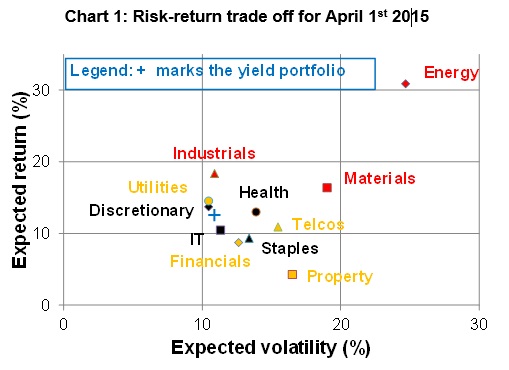
What I want to stress is that the best expected return does not usually imply the best sector. To show this, I have plotted the expected returns for each sector against the relevant expected volatilities – which we often call risk for brevity – in Chart 1. But there is so much more to risk than just volatility!
 Source: Woodhall Investment Research
The Energy sector (top right red diamond) has by far the highest expected return of all of the sectors (31%) but also the highest risk at 25%. That means, even if the expected return is well constructed on a sound basis, the actual return over the year could finish up almost anywhere because the forecast risk is so large.
About one third of the time, we would expect the actual return to be outside the range from 6% to 56%! There is also a chance of about one in 20 that the actual return would be outside the range 19% to +76%. We can do better than that!
Comparing Industrials (red triangle) with Materials (red square), the former has both a better (higher) expected return and a better (lower) risk – and so Industrials dominate Materials. The high yield sectors in yellow are clustered well below the red resource-related sectors in terms of expected returns. The black sectors ‘Other’ are also relatively tightly clustered as a group of relatively defensive sectors.
Property stands as a sector with no apparent useful attributes, having the lowest expected return and the third highest risk. However, when a professional builds a portfolio, he or she looks into how the sectors fit together. To produce my Hybrid Yield-Conviction portfolios that I update each month, I use the information contained in Chart 1 plus the correlations between all of the sectors together with the limits or ‘tilts’ that I want to place on possible exposures to each sector. Without such tilts, I could finish up with all of my eggs in one basket and how would that go if the expected return for a particular sector turned out not to be a good representation for the relevant sector?
So there are two quite separate risks I am writing about here. One is expected volatility – or variation around a ‘good’ forecast – for one or a combination of sectors. The other is the risk that our expected return might turn out to be misleading for whatever reason. Appropriate diversification across sectors helps reduce both of these risks – and often by a very large amount.
(If you want to read what I’ve done in my portfolio this month, click here).
Important: This content has been prepared without taking account of the objectives, financial situation or needs of any particular individual. It does not constitute formal advice. Consider the appropriateness of the information in regards to your circumstances.